Culture- ART FEATURE- Seri-al thriller: Pamer's graphic executions
 Take a second to imagine the typical rock poster stapled to kiosks around town. What do you see? Let me guess– an image of a band, photographed from either above or below, artfully posed in some non-musical location, say, sitting on a curb or leaning against the wall of a train station. Yawn.
When I went to the Mudhouse this week, though, it wasn't just the coffee that woke me up. Matt Pamer's exhibition, "Public Domain," yanked me right out of my rock-poster torpor. For Pamer– who designs bills for musicians like Modest Mouse, Neko Case, and the New Pornographers– creating a poster isn't just a job; it's a chance to make art.
In his show statement, Pamer laments the loss of album artwork as an expression of a band's identity (think Santana's Abraxas or The Rolling Stones' Sticky Fingers). He hopes to revive this iconic relationship through the graphic strength of his posters. His aim, Pamer says, is to express the sound of an artist while working with themes that interest him.
Foregoing modern printing techniques, Pamer silkscreens his posters at home in limited runs. The process is painstakingly meticulous. Also known as serigraphy, silkscreen printing involves using one or more screens— carefully placed— for each ink color applied. Pamer's prints pack an immediate visual punch, but a closer look reveals the complexity of his compositional vision and masterful layering technique.
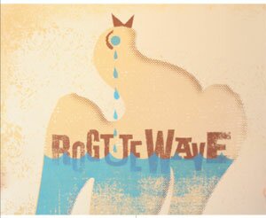
With a penchant for gold and turquoise, often offset by red or russet brown, Pamer incorporates birds, sprockets, and TVs into many of his images. He also plays with odd mixes of texture and pattern. For instance, he combines an ornate floral motif, benday dots (a la Roy Lichtenstein) and a heavily inked woven pattern in one bill for Rogue Wave.
Yet his prints are refreshingly not over-designed. Pamer manages to make even complicated graphics– such as a photograph of ruins at the center of his poster for Explosions in the Sky– easy to absorb so that the overall image retains presence in the viewer's mind. And venue information is always clean and on a single line.
One of the show's strongest posters is for Nada Surf. Here Pamer boldly leaves the frame's upper 3/5 blank grey and then elides this negative space with the top of a red and black maze at the poster's bottom.
It's graphic. It's memorable. It makes me want to hear Nada Surf. Mission accomplished.
Matt Pamer's exhibition, "Public Domain," is on view at the Mudhouse through August 31. 213 W. Main St. on the Downtown Mall. 984-5163.
#