Hook Logo

Containing reality: O’Kane lifts the lid

by Laura Parsons

published 8:39am Monday Oct 25, 2010

Tim O'Kane, "Box #16 / 13 White Eggplants."
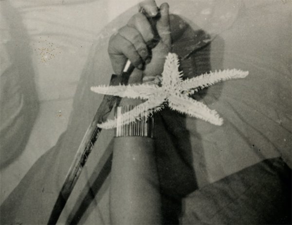
Tim O’Kane, “Box #16 / 13 White Eggplants.”

“Who’s the best painter in Charlottesville?” When asked, I usually launch into a standard answer about how judging art is subjective, and given people’s various styles, techniques, and agendas— not to mention the apples-to-oranges challenge of comparing abstract and realistic work— the concept of “best” simply isn’t useful. But if I’m honest, “Tim O’Kane” comes to mind.

O’Kane, whose exhibition, “Still Life / Current Work” hangs at Warm Springs Gallery, is a virtuoso of hyperrealism. Comprising 16 small and four larger still lifes, the show is a testament to O’Kane’s vigilant observation of the minutest details and his ability to render them exquisitely while simultaneously obscuring evidence of a human hand at work. His attention to light and shadow is so convincing that it’s easy to overlook, yet it creates a depth that suggests the viewer might reach into each painting and lift out its contents.

The exhibition includes two separate but related bodies of work. On the gallery’s south wall, O’Kane presents 10 oil-on-block compositions, each depicting primarily natural items— stones, feathers, eggplants, an onion— contained within an open box or carton. In every one, a contrast of textures adds interest. For instance, in “Box 14 / Quartz & Basalt,” the striated and pockmarked surfaces of the stones are markedly different than the grained edges of the wooden crate in which they rest.

O’Kane creates further drama by letting his objects extend beyond the borders of their containers. The bulbous bottoms and stems of the sensual eggplants in  “Box #16 / 13 White Eggplants” push up and over the edges of their thin cardboard box. Particularly beautiful is the way O’Kane calls attention to the shriveled green caps topping the fruits’ smooth white skin.

The remaining 10 pieces in the show find their inspiration in a poem O’Kane wrote and had translated into Japanese. Occasional glimpses of the graphic script add another dimension to the paintings. In these pieces, the artist plays with the narrative implications of papers folded and bound, like secret talismans, and then placed inside boxes.

The one drawback to the series is O’Kane has mounted the six smaller works on off-white panels that have a distractingly large top margin and— worse— are warped. Given the meticulous precision of O’Kane’s compositions and technique, this imperfect presentation is odd and unfortunate.

Nevertheless, a single flaw cannot dim O’Kane’s brilliance with a paintbrush.

Tim O’Kane’s exhibition, “Still Life / Current Work,” is on view through November 4 at Warm Springs Gallery, 105 Third St. NE. 245-0800.

Orange you glad? Freeman juices the fruit

by Laura Parsons

published 8:49am Monday Oct 18, 2010

"Survival I" by Richard Freeman.
“Survival I” by Richard B. Freeman.

Roanoke sculptor Betty Branch tells a story from the days when she was a young bride involved with a fundamentalist church. Every Sunday afternoon, she and her husband would call on people at their homes. In one household, the wife always served mouthwatering biscuits, and Branch finally asked for her secret. “Oh, honey,” the woman said, “if you do something everyday, eventually you get good at it.”

I remembered Branch’s anecdote while viewing Richard B. Freeman’s exhibition, “Survival,” at Angelo jewelry store. A large, spherical orange occupies the center of each of Freeman’s eight acrylic paintings and two graphite drawings. Although the artist offers several motifs and subtly varies his palette and technique, the fruit is always the key ingredient. And the truth is the man knows how to paint an idealized orange.

In his artist’s statement, Freeman explains his work reflects his experience with sickness and survival and that the ever-present orange symbolizes of his life force. The precise meaning of his images, however, is clearly personal and remains obscure to outside viewers. Nevertheless, Freeman’s compositions, hovering somewhere between surrealism and abstraction, are graphically strong.

In several pieces, Freeman sets his orange on a square slab and overlays the austere scene with vertical bars, resembling a cage, made from collaged fragments that include dollar bills, bits of text, and cut-up book and magazine illustrations. He then surrounds the central image with a painted border that suggests a frame, layering and scraping away pigment tot create the impression of age and weathering.

Another Freeman trope is to semi-enclose his orange within the claw-like roots of a stylized tree (it’s unclear whether the tentacles are meant to be protective or threatening). The artist’s consistent attention to palette and small details is evident in how the confetti-like dots that push his tree toward pointillism in “Emerge” include the pale yellow Freeman uses as a background for the dotted ground below the orange, which here floats in midair.

One of the most successful pieces in the show is also the smallest. Combining numerous Freeman motifs, the meticulously drawn “Rebellious” features tree roots that not only descend over the central orange but also extend through the bars of the cage enclosing the fruit. Here, Freeman’s mix of geometric and narrative content is particularly effective.

Freeman’s oranges are undeniably repetitive, but the juice is subtly different from one image to the next— and it’s almost always delicious.

Richard B. Freeman’s exhibition, “Survival,” is on view through October 31 at Angelo. 220 E. Main St. on the Downtown Mall. 971-9256.

The public option: Craghead opens the books

by Laura Parsons

published 12:41pm Monday Oct 11, 2010

Image by André Lemos.

How to measure success? For many artists, the acme is having their work selected for the Whitney Biennial or perhaps profiled in Art Forum. For Warren Craghead III, though, the pinnacle is making art as publicly available as possible. He often leaves post-it drawings on gas pumps and in grocery stores, and he offers do-it-yourself books at his website for people to print and staple themselves.

This month, Craghead brings together an international group of like-minded artists for the exhibition, “Leaf and Signal,” at The Bridge. Consisting of original works and pages printed from computer files, the show’s artwork comes from books self-published by three individual artists and three collectives, who practice what Craighead calls “lo-fi” publishing. A few of the pieces are framed, but most— and there are hundreds— are plastered to the walls using wheat paste to create the feeling of street art.

“I wanted to kind of overwhelm if I could,” Craghead says.

The floor-to-ceiling mosaic of images on the gallery’s south wall represent Southport, England-based Café Royal, a group helmed by former abstract painter, Craig Atkinson, whose own mixed-media works fill the southern end of the east wall. The overall aesthetic is often raw and cartoonish, but there are moments of refinement, such as the tie-wearing, faceless heads drawn by Daniel Mackintosh in a series that mocks gallery-goers with captions like, “At openings this month, I will behave in an aloof fashion and won’t talk to anyone. I will stand out.”

In contrast to Café Royal’s organized chaos, Kelly Lynn Jones’s San Francisco publishing group, Little Paper Planes, creates meticulous letterpress prints (on view in the main gallery) and complex color works (displayed in the Bridge’s anteroom). Falling somewhere between Jones’s and Atkinson’s approaches is André Lemos’s Opuntia Books, based in Lisbon, Portugal. Lemos, who was last in town for the Craghead-curated SSG show, “Impera et Divide,”— and who painted a mural on the Bridge’s exterior— publishes everything from children’s monster drawings to complex collages in books that often feature unusual aspects like velum overlays or fold-out sculpture.

The individual artists included in “Leaf and Signal” each use books to respond to the physical world. England-based Oliver East creates watercolor and pen-and-ink impressions of his travels for his series “Trains are…Mint.” Franklin Einspruch also paints personal experiences, often supplementing his watercolor images with haiku-like poems. Meanwhile visual poet Geof Huth plays with typography and also photographs environmental poems he composes.

For Craghead, artistic success is literally— and literarily— about public exposure.

The exhibition, “Leaf and Signal,” curated by Warren Craghead III, is on view through October 30 at The Bridge. 209 Monticello Road (across from Spudnuts). 984-5669.

Home eco: Costello digs domesticity

by Laura Parsons

published 8:53am Monday Oct 4, 2010

Patrick Costello, "The Things We Do to Make Do."
Patrick Costello, “The Things We Do to Make Do.”

Making art is by nature a personal experience, but it’s rare that an artist’s work and life offer as seamless a continuum as Patrick Costello’s. Like a Möbius Strip, Costello’s daily endeavors— often focused on growing and preserving food in a sustainable way— lead to his art, and the ecological ideals of his art lead to his everyday actions. This integration of existence and expression is the key to Costello’s beautifully unified exhibit, “Cheer On,” currently installed at The Garage.

Comprising geometric paintings— often with narrative content— letterpress images, screen prints, and sculptural pieces, the show addresses the efforts people are making to recover an environmentally sound way of living. But rather than wagging his finger and taking the preachy high road, Costello has created a homey show, filled with warmth and nostalgia for planting gardens, recycling worn-out clothes into quilts, and canning homegrown goods. Costello furthers this feeling of grandma’s-kitchen comfort with a mix-and-match approach to framing.

The sweetness of his message, though, does not compromise Costello’s artistic integrity. The former UVA Aunspaugh fellow combines a flat, linear aesthetic with an interest in textile design. Each piece is distinct, yet Costello threads them together through palette, symbolic repetition, geometric elements, and stylistic flourishes. For example, the hair and beards of his farming figures, which occur in several works, are similar to repeated compost heap images and the textured tops of recurring acorns.

Deftly using a palette dominated by browns, grey-blues, and ochre, Costello’s pieces woo viewers with a satisfying symmetry, although small moments of asymmetry keep things lively. For instance in the quilt-like acrylic painting, “The Things We Do to Make Do,” the top of a diamond of intersecting dodecagons features a linear pattern that descends into a fringe of arms hanging down, with an implied but inexact symmetry, ending in hands holding multicolored jars of canned preserves. Below, overlapping leaves/gloves drape over the backs of twin mirrored figures planting stylized saplings.

The piece de resistance of the show, however, is the sod-roofed “Shack,” which Costello has constructed from recycled lumber and typesetting drawers, and hung with beaded lamps crafted by his grandfather. The chevron-patterned floor of brown and blue planks points to a whitewashed back wall, where seven shelves dazzle with color-coordinated jars of jellies, pickles, sauces, and preserves canned by Costello himself, their hues as delicious as what they hold.

Costello’s embrace of life as art and art as life is definitely something to cheer on!

Patrick Costello’s exhibition, “Cheer On,” is on view through October 31 at The Garage, 251 First St. NW (across from Lee Park). Gallery hours by appointment; for more information, e-mail [email protected].

Glitter, Glitz, & Glam: Lady Gaga rocks the JPJ

by Stephanie Garcia

published 5:22pm Thursday Sep 9, 2010

review-gaga-1Lady Gaga dons a fan’s home-made UVA shirt during “Telephone.”
PHOTO BY TOM DALY

Update: Check out the SLIDESHOW from Lady Gaga’s Glitterway.

——————————-

The premise that Lady Gaga is the Madonna for Gen Y — the sex appeal, the pop, the choreography— is accurate, but it’s lazy at best. Gaga goes deeper than she gets credit for, decades beyond just cone bras in the ’80s, taking inspiration from rockers whose fans probably can’t stand her— from Elvis Presley’s scandalous hip-wiggles to Bowie’s androgynous glam. As a revolutionary, Gaga surpasses them, if only because they laid the groundwork.

“I love Gaga because she’s a combination of Madonna’s sexuality and Michael Jackson’s morbidity that she brings to a new level,” said fourth year UVA student and Gaga follower Tasha Nadasdi. “Everyone else plays it safe with standards. She says, ‘F*** it.’”

Hordes of sparkly, scantily-clad, slightly intoxicated UVA boys and girls flooded the John Paul Jones Arena last night, along with greying but fabulously energetic middle-aged adults, all of them shouting out Gaga’s name and waving (more)

Elsinore

by Vijith Assar

published 3:36am Monday Sep 6, 2010
September 14, 2010 8:30 pm
$5

Indie pop. With Red Satellites.

Red Satellites - Good Press
Red Satellites - Dancing

Colorful vocabulary: Baines abstracts the drama

by Laura Parsons

published 11:11am Sunday Sep 5, 2010

Katie Baines, "tightrope."
Katie Baines, “tightrope.”

“These shouldn’t work” was my first thought while standing in Ruffin Gallery looking at Katie Baines’s recent paintings. A visiting faculty member in UVA’s art department, Baines creates shape-strewn abstracts, combining numerous techniques from airbrushing to stenciling to brushwork, in colors that would normally clash but somehow mesh. And work, they do.

The best approach, I discovered, is simply to yield, allowing each of the 10 acrylic-on-panel paintings to unfold. After a few minutes, Baines’ visual vocabulary begins to make sense. From piece to piece, she deploys a similar set of elements— thin parallel lines fluid in their irregularity, waving polyps, scalloped borders, stenciled shapes and their echoes, etc.— that unite her complex compositions and move the viewer smoothly from one small event to the next.

For instance, in “glowing cell,” overlapping vertical rectangles of brown, orange, ochre, and olive drip down like stylized stalactites in the top left corner and have their colors repeated in boxes of lines, reminiscent of topographical maps, at the bottom of the painting. The earthy colors occur again as curving ochre shapes with diffuse olive edges that enliven the interior of a purplish cell— its hues as varied as a bruise— at the heart of the painting. Meanwhile, two small tiger-striped cylinders of red and chartreuse occur in an egg shape placed inside the “line boxes” but also have twins afloat in the purplish cell stenciled with overlapping ovals.

Nothing in Baines’s paintings happens in isolation— there is always a call and response between the elements. Although abstract, her compositions are rife with animated drama arising from the cartoon-like interplay of shapes and colors. In “tightrope,” forms of pale blue, yellow, grey, rust, brown, and orange seem to hang from a slack aqua line, while below, their “shadows” appear to rest beneath a frosted dome. In the background, a white line suggests a horizon above what seems to be a dark body of pooling water edged by stylized swamp grass.

Baines’s paintings are like poetry; each work contains a number of stanzas that resonate with each other and circle back to variations on a chorus. Although her techniques are distinct, the dizzying complexity of her compositions and playful “everything including the kitchen sink” approach to palette recall Wassily Kandinsky’s abstracts. The longer one looks, the more “aha” moments emerge and entertain. And what at first may have caused head-scratching suddenly makes brilliant sense.

Katie Baines’s recent paintings are on view through September 17 at Ruffin Gallery. Ruffin Hall, 179 Culbreth Road. Katie Baines will give an artist’s talk at 5:30pm, September 15 in Campbell 160. 924-6123.

Out of Africa: Man Ray adjusts the lens

by Laura Parsons

published 8:44am Monday Aug 30, 2010

Man Ray, Noire et blanche, 1926 ©2010 Man Ray Trust/Artists Rights Society (ARS), New York/ADAGP, Paris.
Man Ray, “Noire et blanche,” 1926 ©2010 Man Ray Trust/Artists Rights Society (ARS), New York/ADAGP, Paris.

“Wow” is not a word you see on this page. So pay attention. Almost a year ago, University of Virginia Art Museum director Bruce Boucher announced the museum would be hosting a Man Ray show this fall. Since then, I’ve been counting the days. But I had no idea what a rich and enriching experience awaited me. Wow.

More than an exhibition about Man Ray’s work, “Man Ray, African Art, and the Modernist Lens” examines a zeitgeist moment in 20th century art and culture in the U.S. and Europe, when African art shifted from being regarded as anthropological evidence to being celebrated as fine art worthy of appreciation and imitation. The show includes over 50 photographs by Man Ray, as well as images by his contemporaries (e.g. Walker Evans and André Kertész), displayed alongside the actual African pieces photographed. In addition, the exhibit presents African-inspired artwork from the period, along with books, magazine articles, and catalogues.

Man Ray became intrigued by African art at a 1914 exhibit at Alfred Stieglitz’s New York City gallery. He began photographing the masks and figures— but in a new way that called attention to their aesthetic value devoid of cultural context. Following World War I, the artist moved to Paris and fell in with the Surrealists, who began incorporating African art into their own pieces.

A particularly wonderful section of the exhibit compares Paris-based Man Ray’s and U.S.-based Walker Evans’s photographs of the same carved figure, the “Bangwa Queen,” from Cameroon. Evans shoots the figure in a straightforward documentary style, but Man Ray plays with camera angles and lighting, creating dramatic shadows and infusing the object with life.

The show also looks at how Harlem Renaissance artists embraced African art (see, in particular, the wonderful small painting by Loïs Mailou Jones), and how African art led to a fashion trend dubbed “La Mode au Congo.” In fact, Man Ray’s famous “Noire et blanche” was originally published in Vogue magazine in 1926.

“Man Ray, African Art, and the Modernist Lens,” is simultaneously a biography, a history lesson, an exhibit of African art, a show of modernist photography, and an inquiry into cultural appropriation and projection. The accompanying commentary is extensive and informative, although some of the academic interpretation is a bit “flavor of the day.” (The idea that the white face “confronts” the black mask in “Noire et blanche” is silly.) All in all: Wow!

“Man Ray, African Art, and the Modernist Lens” is on view through October 10 at the University of Virginia Art Museum. The Museum is hosting numerous special events and a Man Ray Film Festival to coincide with the show. Check the Hook’s online art calendar or the UVA Art Museum website (www.virginia.edu/artmuseum) for the schedule.. 155 Rugby Road. 924-3592.

Man Ray Film Series: “Man Ray: Filmmaker”

by Laura Parsons

published 1:09pm Tuesday Aug 24, 2010
October 4, 2010 5:30 pm


Still from Man Ray’s L’Etoile de mer (The Starfish).

In association with its exhibition, “Man Ray, African Art, and the Modernist Lens,” the University of Virginia Art Museum’s Man Ray Film Series presents “Man Ray: Filmmaker,” which will screen the following five short films by Man Ray: Retour a la raison (Return to Reason); Ballet mécanique; Emak-Bakia; L’Etoile de mer (The Starfish); and Les Mysteres du Château de Dé (The Mysteries of the Chateau of Dice). Discussant: UVA Art Museum curator Matthew Affron. Campbell Hall 160. 924-3592.

Generation Jazz

by Vijith Assar

published 2:38pm Sunday Aug 22, 2010
August 26, 2010 8:30 pm
$5

Young jazz singers

Abandoned beauty: Bronson breaks it down

by Laura Parsons

published 9:04am Monday Aug 16, 2010

Bonny Bronson, "Imagine."
Bonny Bronson, “Imagine.”

It’s nervy to co-opt the title of a world-famous photographer’s book and body of work (which also serves as the title of an award-winning documentary about the artist) and use it as the name of your own photography exhibit. But that’s exactly what Bonny Bronson has done with Sally Mann’s What Remains.

Bronson’s “What Remains: Ruins, Relics and Rust” is currently on view at The Gallery @ 5th & Water. Whether the coincidence of titles is accidental—which I suspect—by calling her show “What Remains,” Bronson has set the stage for an unfortunate comparison in the eyes of viewers familiar with Mann’s work.

Bronson’s project, however, is distinct. Whereas Mann’s What Remains examines impermanence through images of decomposing cadavers, Bronson’s 33 photos depict abandoned objects and architecture. Mann’s black-and white or sepia photos involve a wet colloidal technique; Bronson’s are straightforward color shots. At the heart of both artists’ endeavors, though, is a fascination with the emptiness and decay of what was once lived-in—whether bodies or buildings.

It’s not new territory, and Bronson tends to re-walk well-worn paths. Dusty bottles? Check. Broken windows? Yep. Rusted-out cars? Uh-huh. Peeling paint and vine-entwined structures? Done and done. What Bronson offers, though, is an eye for color and an infallible sense of composition.

Bronson is a “good” photographer who plays by the rules: she understands how to use a central axis without centering her subjects; she’s aware of geometry and the strength of diagonals; and she’s attentive to natural light. Her analysis of each shot is precisely calculated, and there are no missteps. Collectively, her images could form the “decay” or “abandoned buildings” category in a stock photography catalog. All are solid if detached and dispassionate.

Nevertheless, Bronson does find beauty in some surprising places, especially with regard to color. In “Reflections,” an empty warehouse with standing water and peeling walls and uprights, half white and half green-flecked blue, resembles an abstract painting through Bronson’s lens. And in “Rusted Security,” green mottles the corroding surface of a magenta fuel tank and the chain dangling from its useless lid.

The latter photograph gets a boost from hanging on an olive green wall, indicative of the care Bronson has taken with presentation. She uses 5th & Water’s challenging space to maximum effect.

“What Remains” is not What Remains, but Bronson nevertheless creates a few diamonds in the rust.

Bonnie Bronson’s exhibition “What Remains: Ruins, Relics, and Rust” is on view through August 31 at the Gallery @ 5th & Water. 107 5th St. SE (located in the upstairs foyer of Hampton & Everett and Stoneking/von Storch). 979-9825.

Tiny launchpad: ‘Garage’ cofounder Daughdrill does Detroit

by Courteney Stuart
(434) 295-8700 x236
published 4:11pm Monday Aug 9, 2010

news-garageThe Garage remains a tiny but vital home for local music and art.
PHOTO BY COURTENEY STUART

Anyone want to relocate to Detroit? For many, images of decline and destruction in a once great American city make that a question with an easy answer: no way. But for an increasing number of artists, Detroit’s decay is a siren song, according to an August 3 New York Times piece that focuses on the work of artist and former Charlottesvillian but now Detroitian Kate Daughdrill, best known locally for her work as co-founder and curator of the tiny downtown arts venue The Garage on the west side of Lee Park.

Daughdrill’s new creative effort in Detroit— dubbed Soup— is a once-a-month meeting of the city’s creative types who pay a $5 fee for a bowl of soup, salad, and dessert. At the end of the event, participants vote on the projects. The winning idea is given the money collected for Soup.

“It started with 15 people who wanted to make a grant for each other,” says Daughdrill, noting that since publication of the Times piece, she’s been contacted by other artists across Detroit wanting to start Soup in their own neighborhoods. “If you’re doing things with heart,” she says, “it gives rise to really meaningful creative gestures.”

In September 2009 , after six years in Charlottesville, Daughdrill arrived in Detroit for grad school at the (more)

Water marks: Versluys pulls one-offs

by Laura Parsons

published 7:34am Monday Aug 9, 2010

Kathy Plunket Versluys, "Splash Down."
Kathy Plunket Versluys, “Splash Down.”

When artist Kathy Plunket Versluys began her rain-themed series of monotype prints, she could not have predicted how parched Charlottesville would be when they went on display. But the charm of Versluys’ lighthearted exhibition, “Precipitation,” currently on view at Angelo, is its reminiscence of what a good drenching feels like.

In Versluys’ rainy world, dogs prance through puddles while their owners wrestle with bumbershoots turned inside, and men in suits hunch beneath umbrellas, buying flowers on their way home from work. Such easygoing fare belies the inherent challenge of monotype printing. Unlike other printmaking techniques— etching, block printing, silkscreening, etc.— the artist gets one shot at making a successful image (putting the “mono” in the monotype).

For each of the 11 works in “Precipitation,” Versluys has carefully manipulated black ink on a plexiglass plate, mindful of what the composition would look like in reverse, before pressing paper against the plate to create the print. Because monotype prints rely on the thickness and distribution of the ink, they are by nature somewhat unpredictable, a characteristic Versluys uses to her advantage.

In fact, the more she lets chance come into play, the more energetic and fun her work becomes. For instance in “Splash Down,” downward diagonal streaks, running from left to right, suggest wind-driven rain falling around two figures composed of a rough series of marks that are, nevertheless, convincing. Adding to the dynamism are three diamond shapes jutting toward the upper right that suggest the sudden reversal of one figure’s umbrella, echoed in the translucent, upward strokes representing the figure’s head, which humorously appears to look with envy at the other figure’s right-side-out umbrella.

Elsewhere, Versluys creates stamp-like elements to express both rain and the fabric pattern of umbrellas. In “Camouflage,” each small patch is an abstract composition unto itself, and the endlessly varied ways Versluys scratches, drips, brushes, sponges, and moves the ink in these small areas is mesmerizing.

Versluys introduces color into two prints, “Brainstorm” and “Dark Day at the Market,” a playful idea that doesn’t play out particularly well. In her best pieces, the energy of her marks and the suggested gestures of her figures (including dogs) appear free and unselfconscious, but the addition of color seems to prompt a control by Versluys that robs her images of their spontaneous vitality.

Minor complaints aside, Versluys’ good-humored monotype prints are the next best thing to an actual rainy day.

Kathy Plunket Versluys’ exhibition, “Precipitation,” is on view through August 28 at Angelo. 220 E. Main St. 971-9256.

Face forward: Uncapping the lens of vulnerability

by Laura Parsons

published 2:54pm Monday Jul 26, 2010

Dave Woody, "Boxer, Austin TX (#2)," 2005, Archival digital print, 38 x 30 inches (image), Courtesy of the Artist.
Dave Woody, “Boxer, Austin TX (#2),” 2005, Archival digital print, 38 x 30 inches (image). Courtesy of the Artist.

I thought I knew what I was in for when I visited the University of Virginia Art Museum’s exhibit, “The Figure in Photography, 1995-2005,” curated by museum ace Andrea Douglas and art prof William Wylie. But instead of images examining the human body, what I found was a show highlighting work by eight photographers who, with one exception, explore context-specific, color portraiture.

Each artist dismantles the artificial veneer of formal portraits to disclose the vulnerability of the subjects in front of the lens. Several of the show’s photographers work within particular environments, like Dave Woody, who shoots adolescent boxers before and after bouts. In “Boxer, Austin, TX (#2),” a boy stands in three-quarter view, as sweat beads on his slight but muscled body. The composition is stunning with reds ranging from carmine shorts to ruddy raw knuckles to a pink lower lip. But what holds the viewer’s attention is the tenderness of the young fighter’s expression as he looks wistfully to one side.

The three close-up portraits by Dawould Bey also showcase teenagers. Bey asked high school students, whom he shows seated at desks, to write paragraphs revealing something about themselves. These texts accompany the images, illuminating the inner life of the individuals. In Chan Chao’s series, “Burma: Something Went Wrong,” the photographer portrays young activists living in precarious exile following the military takeover of their country.

Two of the show’s artists take a different tack, manipulating the circumstances under which they photograph their subjects. Sharon Cole’s “Drunk Series” presents formal headshots of inebriated partygoers. Their eyes half-lidded, Cole’s subjects can’t muster the pretense that normally accompanies such formal sittings. Similarly, Bettina van Zwehl, takes pictures of women after they’ve slept in white shirts, looking slightly disheveled and confused, or as they hold their breath while lying on the floor in black shirts, creating an illusion of intention.

A small photograph by Vibeke Tandberg and another by Hellen van Meene seem like off-kilter afterthoughts compared to the attention the show lavishes on the work of the previous five photographers. Meanwhile, the work of by Jenny Gage, depicting anonymous bodies shot underwater, seems lifted from a different exhibit— perhaps the one I’d originally imagined. Nevertheless, Gage’s fluid photographs of sun-outlined silhouettes are among the most beautiful on display.

Though unexpected in scope and somewhat odd in image selection, “The Figure in Photography” nevertheless puts a new face on photographic portraiture.

“The Figure in Photography, 1995-2005″ is on view through August 8 at the University of Virginia Art Museum, 155 Rugby Road. 924-3592.

Into the woods: Gray drips toward growth

by Laura Parsons

published 8:03am Monday Jul 19, 2010

Noelle I.K. Gray, "Melange #53."
Noëlle I.K. Gray, “Mélange #53.”

Sadness. Horror. Slack-jawed amazement. These were common reactions to the tree carnage wreaked by last month’s storm. Artist Noëlle I.K. Gray may also have felt secret joy. Where the rest of us saw destruction, Gray perhaps saw opportunity since salvaged wood is at the heart of the 11 wall pieces constituting her exhibition, “Abstracts on Sculpted Wood,” currently on view at Mudhouse.

Gray sands and shapes cast-off ash and cedar pieces from a local lumberyard, preserving crevices and bark, to produce elongated flat surfaces with an organic feeling. She next obscures the underlying wood grain by painting each sculpted cross-section in a rich matte color— teal, carmine, lilac-gray, black— often subtly varying areas of darkness and light.

Over this base color, Gray drips a family of contrasting colors in seemingly random clusters of splotches. Diffuse- or lacy-edged, light-colored circlets radiate from droplets of pure pigment. Gray’s layering is complex, but she skillfully retains a sense of spontaneity in her dripped compositions, giving the impression that strange-hued lichen or algae are growing on the surface of the sculpted shapes.

As a result, her pieces appear to be natural objects, perhaps eroded rocks collected from a riverbed on another planet (although the work closest to the restrooms looks more like a strangely mottled cross-section of a dinosaur bone). Gray has strung her paintings across the wall at varying heights like colorful misshapen clouds or fossilized puddles.

The strongest aspect of Gray’s work is her sensitivity to color combinations. In “Mélange #5,” branching, interconnected filaments of white surround peach and pink droplets that burble across a sage-grey slab. Nearby, soft-edged splotches of tomato red with shadows of ochre and orange mottle the turquoise surface of “Mélange #16.” And in “Mélange #3,” frothy white surrounds olive-green clusters on a charcoal-black background.

Although Gray’s arrangements of colors are meditative and make for pleasant viewing, her technique veers dangerously close to schtick. “I look at my pieces as an emotional emanation; mental pools flowing from one image to the next,” she writes in her artist’s statement. Yet any variation in emotion is hard to detect, and each work, though superficially engaging, lacks the depth and substance required to sustain looking.

Still, Gray’s ability to create unfamiliar yet evocative organic objects is intriguing. And pulling beauty and the suggestion of growth from the scrapheap is no small feat.

Noëlle I.K. Gray’s exhibition, “Abstracts on Sculpted Wood,” is on view through August 2 at Mudhouse. 213 W. Main St. on the Downtown Mall. 960-0804.

The Low Anthem

by Vijith Assar

published 9:14pm Sunday Jul 18, 2010
July 23, 2010 8:00 pm
$13-$15

Now that the Avett Brothers make records with Rick Rubin and stop at the Charlottesville Pavilion on tour, it’s probably the mostly-acoustic Boston multi-instrumentalist quartet The Low Anthem, who play slowly-building self-described “apocalyptic hymals” with occasional gospel touches, that are the reigning up-and-coming buzz band of indie folk. But since their acclaimed 2008 sophomore release Oh My God, Charlie Darwin was recently reissued by Nonesuch Records, perhaps their days are now numbered in that regard as well.

The Low Anthem - Charlie Darwin

Vermont singer-songwriter Anais Mitchell and local folk duo The Honey Dewdrops open.

The Honey Dewdrops - Nowhere To Stand
The Honey Dewdrops - Fly Away Free


Urban build up: Zabawa and Braitman get vertical

by Laura Parsons

published 11:12am Monday Jul 12, 2010

Agnieszka Zabawa, "Up in the Sky."
Agnieszka Zabawa, “Up in the Sky.”

Have you seen Work of Art, Bravo’s latest Project Runway-esque reality series? I was skeptical (understatement) that artists competing against each other in weekly challenges would make for compelling TV, but it’s surprisingly entertaining. Last week, after driving through Manhattan, the artists undertook the task of representing their impressions of New York City.

It’s too bad Charlottesville painter Agnieszka Zabawa wasn’t there, because she’d have had no problem creating a visual answer to this challenge. In fact, she has 15 of them on display in Chroma Projects’ current exhibition, “Uncounted building-wall windows multiplied a mile deep into ash-delicate sky,” which also features glass sculpture by Jackie Braitman.

For Zabawa, New York is a thicket of multi-windowed skyscrapers that loom and lurch over silhouetted pedestrians moving antlike and anonymous on the sidewalks below. Zabawa creates energy by combining media, drawing rough window shapes in pen or crayon and filling them with dabs of paint for panes. In her cartoon-like cityscapes, pastel-colored buildings bend under their own weight, and the only vehicles are yellow cabs seen from overhead.

Which is the problem (perhaps only for me): I feel like I’ve seen these images before. There is a cliché at work that calls to mind animated films that open with the camera zooming down through tall buildings before picking out a protagonist from the city’s bustling throngs. The sense of familiarity makes it easy to miss some of Zabawa’s interesting innovations, such as collaging-in a piece of notebook paper so the squares of its perforated edge serve as windows in “Uncounted building-wall windows,” or painting over pasted-in newspaper in “Shadows of the City.”

In her two most successful pieces, “Up in the Sky” and “Relationships,” Zabada abandons her pastel palette in favor of chalkboard-like surfaces, reminiscent of gritty city pavement. Instead of looking down, the perspective is skyward, and Zabawa creates frenetic energy with marks ranging from white scratches to translucent brush strokes.

Jackie Braitman’s four geometric glass sculptures provide a calm contrast to Zabawa’s paintings. Each rectangular “Silo” is a variation on a theme consisting of four elements: a vertical on one side with an inside curve matched by two abbreviated elements on the other, between which a small cylinder rests. Braitman’s colors are meditative and delicious, including pond-water greens and a raspberry-sherbet purple.

Together Zabawa’s hectic compositions and Braitman’s subdued constructions offer complementary impressions of an urban landscape where the sky’s the limit.

“Uncounted building-wall windows multiplied a mile deep into ash-delicate sky,” featuring paintings by Agnieszka Zabawa and glass sculpture by Jackie Braitman, is on view through the end of July at Chroma Projects Art Laboratory. 418 E. Main St. on the Downtown Mall. 202-0269.

James McMurtry

by Vijith Assar

published 3:17am Wednesday Jul 7, 2010
August 13, 2010 8:00 pm
$15-$17

Solo performance from the gruff and politically-minded Austin roots-rock singer-songwriter, whose bluesy tunes first surfaced thanks to Mellencamp back in the 80’s.

James McMurtry - Cheney’s Toy

David Sickmen opens.


Les Yeux du Monde presents “Academy Concert VI” with Wolfgang Seierl

by Laura Parsons

published 6:10pm Saturday Jul 3, 2010
July 30, 2010 7:30 pm
Adult $15, Ages 10-17 $10, and under 10 Free

Wolfgang Seierl, Untitled.

Les Yeux du Monde, in conjunction with the Wintergreen Summer Festival and Academy, presents “Academy Concert VI (LYDM)” with Austrian guitarist and artist Wolfgang Seierl, whose exhibit, “Composer and Painter,” is currently on view at the gallery. 841 Wolf Trap Road. 973-5566.

Les Yeux du Monde presents Wolfgang Seierl concert, “The Painter as Composer and Guitarist”

by Laura Parsons

published 6:01pm Saturday Jul 3, 2010
July 24, 2010 3:00 pm
Free

Wolfgang Seierl, Untitled.

Les Yeux du Monde presents “The Painter as Composer and Guitarist,” a concert of acoustic and electronic music by Austrian guitarist and painter, Wolfgang Seierl, whose exhibit, “Composer as Painter,” is currently on view at the gallery. 841 Wolf Trap Road. 973-5566.

First Friday: Long day, short walk edition

by Laura Parsons

published 3:07pm Friday Jul 2, 2010

Agnieszka Zabawa, "Up in the Sky."
Agnieszka Zabawa, “Up in the Sky.”

Perhaps you’re thinking, “Wow, the weather sure is nice— what a perfect night for getting my art stroll on!” And you’re half right. The weather is glorious! Unfortunately, many of the art venues in town simply x July and August off their calendars, to start all over again in September, which means the art menu is abbreviated this evening. Fortunately, there are still some tasty visual treats to satisfy your art appetite.

Chroma Projects Art Laboratory is breaking away from its group-show format to showcase two artists, sculptor Jackie Braitman and painter Agnieszka Zabawa, in the poetically named exhibition “uncounted building-wall windows multiplied a mile deep into ash-delicate sky.” Zabawa is a newcomer to the area from Poland, and I’m intrigued by the architectural image she’s created that accompanied the show’s announcement.

Another promising show is Lana Lambert’s exhibition, “From the Woods to the Ocean,” featuring her exquisite prints, in the main gallery at the McGuffey Art Center. And if prints are your thing, you’ll also want to stop by Angelo, which is  showing monoprints by Kathy Plunkey Versluys.

The recent heat wave took its toll on many gardens, so if you’d like to see flowers more in bloom and less wilted on the stem, stop by the WVTF and Radio IQ Studio to bask in the lushly petaled paintings of Ellen Hathaway.  Flowers are also on display at Spring Street where Helen Jamison is showing floral watercolors.

Quite a few venues—McGuffey, Art Upstairs, and Warm Springs Gallery—are offering summer group shows featuring a smorgasbord of work by their members, just in case you’re in the mood for a multi-choice buffet.

Here’s the complete assortment of options on this evening’s art tasting menu, which is short but decidedly sweet:

First Friday, July 2

The McGuffey Art Center opens two shows: Lana Lambert’s “From the Woods to the Ocean” and the annual “McGuffey Members’ Summer Groups Show,” 5:30-7:30pm. 201 Second St. NW. 295-7973.

Angelo celebrates Kathy Plunkey Versluys’s exhibition, “Precipitation: Monotypes Celebrating Soggy Times,” with an opening reception, 5:30-7:30pm. 220 E. Main St. on the Downtown Mall. 971-9256.

Café Cubano welcomes landscape architect Bill Mauzy’s exhibition, “Stone and Water,” with an opening reception, 5-7pm.. 112 W. Main St. on the Downtown Mall (in York Place). 971-8743.

Chroma Projects Art Laboratory opens “uncounted building-wall windows multiplied a mile deep into ash-delicate sky,” a two-person exhibition featuring work by sculptor Jackie Braitman and painter Agnieszka Zabawa. 5-8pm. 418 E. Main St. on the Downtown Mall. 202-0269.

The WVTF and Radio IQ Studio opens its exhibit paintings by Ellen Hathaway, 5-7pm. 216 W. Water St. For more info, contact Maureen at .

Warm Springs Gallery welcomes “Overviews,” a collection of summery paintings by Andras Bality, Sally Bowring, Henry Isaacs, Donald Lewis,  TIm O’Kane, Elizabeth Price, and Susan Spies, plus a sampling of work by  U.S., Australian and New Zealand glass artists. 5-8pm. Cellist Tobi Werner will perform beginning at 7pm. 105 Third St. 245-0800.

Sage Moon Gallery, LLC hosts an opening reception for the work of oil painter Ed Gowan. 6-8pm, at Siips. 212 E. Main St. on the Downtown Mall.

Spring Street opens “Flowers in Bloom,” a show of watercolors by Helen Jamison, 6-8pm. 107 W. Main St. on the Downtown Mall. 975-1200.

BozART Gallery opens “Flooding the Space between Sleep and Wake,” an exhibition of Ken Horne’s oil and acrylic abstract paintings “inspired by the edge of the unconscious experienced in the period just before sleep and just after wake.” 5-9pm. 211 W. Main St. on the Downtown Mall. 296-3919.

The Contemporary Craft Co. celebrates its exhibition of work by Susan Patrick, 5:30-8pm. 427 E. Main St. 295-3000.

Art Upstairs opens the group show, “Local Landscapes; Works inspired by the landscape we live in,” 5-8pm. 112 W. Main St. (in York Place). 923-3900.

Skylight Studios opens its showcase of the collage and found-object assemblage work of artist Julia Cates with a reception, featuring live music by The Dreamtimeproject. 5-9pm. 108 Second St. 293-3908.

Reel to Tweel: Filmmaker scores at LA film fete

by Rachel Obenschain

published 10:13pm Wednesday Jun 30, 2010

news-makebelieveclaytweel2x1
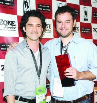
Producer Steven Klein and Director J. Clay Tweel at the LA Film Festival Awards Brunch
PHOTO COURTESY WIREIMAGE.COM

Sometimes, the first time is the charm. Out of a pool of over 2,000 submissions, Charlottesville native J. Clay Tweel felt lucky just to have his directorial debut shown at the Los Angeles Film Festival. But he was astounded to learn that his picture was the feature documentary winner.

“I was literally speechless,” Tweel laughs. “I had no idea that I would win the award or that it was even possible. Documentaries like Make Believe don’t win a lot of critical awards because it’s not about a social issue.”

While Tweel’s family was present for the premiere earlier in the week, they received the news of the win on Saturday, June 26 after the awards brunch. Tweel’s father, local lawyer Ron Tweel, was floored.

“You always hope for these things, but it was shocking,” says the elder Tweel. “I’m still grinning frankly.”

In addition to the honor of winning the Jury Award for a feature documentary, Tweel received an unrestricted check for $50,000 presented by Academy Award-nominated actress Gena Rowlands. However, the recognition may prove more vital than the prize money.

According to indie documentarian Chris Farina, distributors take a close look at film festival winners, so a win at any festival is a great launching point— particularly one with 80,000 attendees.

Make Believe emerged from producer Steven Klein’s personal encounter with boys in a magic shop as well as his own past endeavors as a teenage magician. The film follows the lives of (more)

login | Contents ©2009 The HooK